Friday, December 10, 2010

Color of the Year: Honeysuckle Pink

So yesterday's Color of the Day (a brilliant shade of blue) was totally upstaged by the announcement of Pantone's Color of the Year for 2011! It's official: 2011 is the year of Honeysuckle Pink:


As I've mentioned before, I'm typically not a pink gal. It's definitely not my go-to color, but every now and then I enjoy a bright infusion of a happy color, like, oh I don't know . . . honeysuckle pink.

In the spirit of open-mindedness, I've decided to embrace the honeysuckle pink trend in 2011. And so, beginning the first week of January, the color of the day for one day each week will be -- yes, honeysuckle pink. My objective? To learn just why honeysuckle pink earned this distinct honor. (Perhaps it's versatile? Or mood-boosting? Or maybe it's an unexpected neutral? Only time will tell!)


In other news, I'm headed to Florida this weekend to attend my brother's college graduation (congratulations, Tommy!) and hopefully soak up a little sun while enjoying some family time. In the meantime, I leave you with this image of (what else?) a honeysuckle pink-infused sitting room:


Happy Weekend!

Thursday, December 9, 2010

Color of the Day: Blue

The design community is abuzz about Lonny Magazine & Traditional Home's announcement that Lonny co-founders Michelle Adams and Patrick Cline have been tapped to launch an online version of Traditional Home next year. Yay! Read more about the digital collaboration here.

In honor of this exciting news, today's Color of the Day image comes from Lonny Magazine:

I love the richness of the blue walls and the airiness of the window treatments. How perfect.

Tuesday, December 7, 2010

Color of the Day: Winter White (Act II)

Today's forecast promises more snow flurries for New York City! It seems fitting to celebrate winter white again:

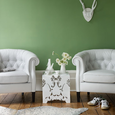
image via Living etc Magazine

Those bright white, tufted armchairs are absolutely stunning, particularly against that muted green wall.


Monday, December 6, 2010

Color of the Day: Winter White

It has officially turned cold in New York, which means winter is just around the corner. And winter means snow, which explains why I've had winter-white interiors on the brain:

image via Living etc

I'm really digging the white mirror and the white pouf -- and the contrast between the beautiful hardwood floors and everything else.

Friday, December 3, 2010

Le Weekend

After a long week at work, I'm really, really looking forward to the weekend. My weekend plans (in no particular order):

1. Buy holiday cards.
2. Attend the Martha Stewart Holiday Craft Sale (!). For anyone in the NYC area, the sale is taking place on Saturday from 12 to 6 at 601 West 26th Street (the Starett-Lehigh Building).
3. Shop for beads the Garment District.
4. Watch college and professional football, Boardwalk Empire and The Real Housewives of Atlanta.

And that's it (for now)! I've also been doing a lot of blog and twitter housekeeping recently, so there's a good chance I'll be back on the blog before the weekend is over. Until then, happy weekend!

Thursday, December 2, 2010

Color of the Day: Pink

Pink is not one of my go-to colors, but there is something perfectly feminine about this living room:

image via Ideal Home magazine

Wednesday, December 1, 2010

Exciting Blog News!

Here's a little confession: My blog persona has evolved a bit over the past several years:

Back in 2007 (when I was still in grad school), I began blogging under "The Fashion Obsessed Sports Fan." The name of that blog was pretty self-explanatory -- perhaps too self-explanatory.

In 2008, I decided to change the name of the blog to "Stilettos on the Gridiron" -- same concept, flashier title.

And finally, earlier this year, I decided to re-brand my blogging identity once again, this time to reflect the obsession intense appreciation I've developed for all things design.

Now for the exciting news: All of my pre-Ruby Perrin Design blog content is finally available here on the Ruby Perrin Design blog (including pictures that capture the extreme transformation my bachelorette pad has undergone over the past two years -- click on the "Apartment" link on the right to see what I'm talking about)!!!

I'm so happy that all of my blog content can now live together happily on the web. I would have done this so much sooner had I realized how easy it is to do on Blogger.

Enjoy!

Tuesday, November 30, 2010

Wish I Were Here...

The past month has been a whirlwind of activity, capped off by a very eventful (in a good way) Thanksgiving weekend in New York with my family. And I've been working. A lot. (I even traveled cross-country for a business trip!)

I've decided that the best way to recover from all of this activity (and to prepare myself for the remainder of the busy holiday season) is to enjoy pictures of pretty interiors. Like this one:


via apartment therapy


Tuesday, November 2, 2010

Where I've Been...

In no particular order:

1. Work. It's been busy.

2. Catching up on Mad Men (really, Don?) and Boardwalk Empire (Atlantic City is no joke).

3. Italy! Last month, I spent 9 glorious days in Rome, Florence and Venice. It was amazing. My favorite part of the trip:


And that's basically what I've been up to. I know, these hardly suffice as excuses for a nearly two-month absence from the blog (ack!). But I'm back, and I will be better. There are so many things I've wanted to blog about (including Rue Magazine -- I'm in love with that publication!), and I am finally in a position to focus on the blog again. Yay! Perhaps this is a sign of maturity? I am turning 29 on Friday...

See you again here soon. Promise.

Tuesday, September 7, 2010

DIY: IKEA Frosta Stool

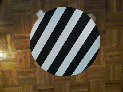
Today I thought I'd share pictures of a DIY project I tackled this weekend: adding black and white stripes to an IKEA Frosta stool. This was a very easy project, and I'm very pleased with how it turned out:

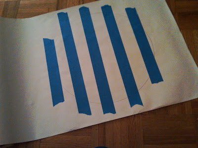
First, I traced the top of the Frosta stool on a sheet of white contact paper and used blue painter's tape to mark the stripes:


Then I painted the "exposed" areas of the contact paper with black acrylic paint:


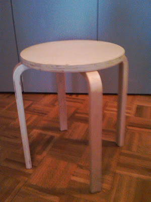
This is what the stool looked like before I placed the striped contact paper on top:


And this is what it looks like now: (!)


P.S. Please excuse the inconsistent quality of these pictures. I snapped these with my camera phone!

Saturday, September 4, 2010

Happy Labor Day Weekend!

image via Psychology Today (seriously!)

I couldn't be more excited about a 3-day weekend. My only plan? To relax as much as possible. And maybe to accomplish a few of the following items on my to-do list, in no particular order:

1. Give one of my IKEA Frosta stools a little more personality. (Maybe with black and white stripes?).

2. Check out the Barneys Warehouse Sale. (Last weekend of the sale = additional markdowns).

3. Brave the crowds and get a firsthand look at the John Derian for Target collection, which debuts in stores on Sunday. (If I want a chance at procuring anything at my neighborhood* Target-- Brooklyn's Atlantic Center store -- I need to get up in time to be there when the store opens -- at 8 a.m.)

4. "Window shop" at the Bloomingdale's Big Brown Bag Sale.

5. College football. College football. College football. (For more on my love of college football, check out Stilettos on the Gridiron, the blog I started -- and don't update as often as I should -- to celebrate, among other things, my love of college football.)

* I live in Manhattan, but it takes me less than 15 minutes to get from my apartment to the Atlantic Center Target by train. So it's in the neighborhood. Sort of.

Thursday, September 2, 2010

Home Office Makeover: Oval Office Edition

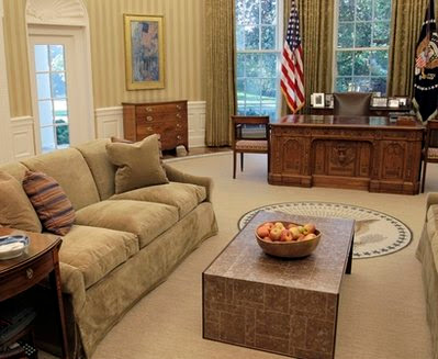
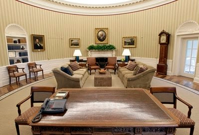
Ever since the White House's big reveal of the Oval Office renovation earlier this week, the design community has been abuzz. The new look is very neutral and understated, but I think I like it.

Before:

After:
I'm digging that coffee table.

The view from behind THE desk.


Tuesday, August 31, 2010

Color of the Day: White + Texture

I love the pairing of a stark white wall (or stark white furniture) with visually interesting textiles:

I love the rug that managed to position itself in the foreground of this picture (and have been searching for a similar one -- in black and white -- for my entry).

Love this room. Those curtains are to die for.

Those throw pillows + that graphic rug = perfect.

(All images via decorpad. Second image via decorpad via Lonny Magazine.)

Monday, August 30, 2010

Mad Men Does Snack Bowls

Did anyone else notice the *adorable* snack bowls (my official term for them) perched on the SCDP conference room table during Don's disastrous Life cereal presentation on Sunday night's episode* of Mad Men? As disarmingly drunken as Don's presentation was, I still managed to be distracted by those beautiful bowls (filled with nuts? pretzels?). Anyone know more about these bowls? Anthropologie's ikat bowls (shown below in green) are the closest I've been able to find so far:
* I DVRed Sunday night's episode and watched it immediately after watching the Emmys -- congratulations to Mad Men the best show on television on its Emmy three-peat!


Monday, August 23, 2010

Color of the Day: Chalkboard Gray

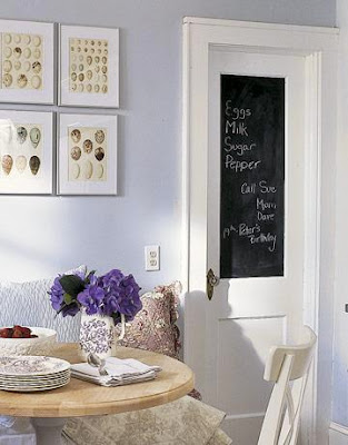
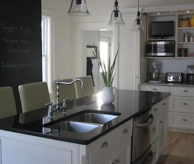
I've been entertaining the idea of using chalkboard paint in my apartment ever since I moved in (nearly two years ago). I still haven't worked up the courage to do it, but I have found a ton of inspiration images online:


This is the entry in Vancouver resident Tracy Falk's studio apartment. Tracy's apartment is marvelous, and has been featured on several design blogs. And p.s. -- how great is that lamp? (Image via Apartment Therapy)

image via decorpad

image via decorpad

image via decorpad

image via flickr (Handmade Evolution)

Monday, August 16, 2010

Color of the Day: Seafoam Green

As summer begins to draw to a close (summer never seems to last long enough), I find myself making plans to make at least one more trip to the beach before it's time to carve pumpkins and get started on my holiday shopping (gasp!). Perhaps that's why I have seafoam green on the brain:


(All images via decorpad)

Tuesday, August 10, 2010

Jane Sterling: Stealth Interior Designer?

Apart from the California scene in which Don Draper Dick Whitman touches up a wall in Anna Draper's living room with a few fresh coats of a pretty shade of Sherwin-Williams blue paint, Sunday night's episode of Mad Men was relatively light on design (however, the last 20 minutes or so were heavy on debauchery, courtesy of Don Draper and Lane Pryce, of all people). So, for this post, I decided to revisit something that I noticed during last week's episode: Jane Sterling has an eye for design! Last week, we learned that Jane had a hand in decorating Roger Sterling's new office. Jane may not know how to choose a husband (or maybe she does?), but she certainly knows how to choose beautiful office furniture. Beautiful Saarinen office furniture. I definitely spotted a tulip table and chairs in Roger's "Italian Hospital" office.

In honor of the new Mrs. Sterling's good taste, here's a little eye candy:

Saarinen Tulip Chair
(image via dwr.com)

Friday, August 6, 2010

Color of the Day: Purple

Today's color of the day is purple. For the first 18 years of my life, I claimed purple as my favorite color. According to the experts, purple signifies power, ambition and royalty! Fancy.

Another summer weekend is upon us, and I couldn't be more excited -- I'm planning to spend some time outdoors and to catch up on some rest. I'll be back on Sunday, of course, for a Mad Men design re-cap. Until then, enjoy the color of the day, and have a great weekend!


Thursday, August 5, 2010

Love: Matt Bernson and Kate Spade Clutches

Everyday objects can be a perfect (in that totally unintentional way) source of design inspiration. In my apartment, I've tried to capture a bit of that spirit by decorating with everyday objects, like books with colorful spines and vintage cameras.

So what happens when an ordinary (or, in the case of the gold bar, maybe extraordinary) object is re-imagined, re-worked and then revealed to the design-obsessed among us? Magic is what happens. Cases-in-point: the Matt Bernson Gold Bar Clutch and Kate Spade's new line of book clutches. How fabulous are these little numbers?

images via mattbernson.com


image via katespade.com

At $99, the Matt Bernson clutch, handcrafted from one piece of molten leather, is a steal (and much more affordable than the vintage Chanel gold bar clutch). A Kate Spade book clutch will set you back a cool $325, but, as with most good design, it just might be worth the investment. Looking for a more wallet-friendly option? Download a free desktop wallpaper inspired by the Kate Spade book clutches.

Wednesday, August 4, 2010

Colors of the Day: Every Color that the Marvy LePen Comes In

Marvy's LePen is, hands down, my favorite pen. It's sleek, it writes smoothly, and it comes in a wide variety of beautiful colors, each of which is an honorary Color of the Day:


I keep a supply of these at work and at home. They're sold in many stationery and craft stores (I've seen them at Michael's and at Kate's Paperie), as well as on Amazon and at Lytha Studios, a Virgina-based, family-run business with an online shop (I ordered my most recent set of LePens from Lytha Studios and was very pleased with the service).

I'm sure it sounds like I've been paid to endorse Marvy's LePen. I have not. It's just that I really love these pens (and those colors!).

Monday, August 2, 2010

Color of the Day: Blue

Up today is blue, which (according to the experts) evokes feelings of tranquility, harmony and protection.


All images via decorpad.


Sunday, August 1, 2010

Helvetica, Meet Mad Men.

I loved tonight's episode of Mad Men -- Don Draper and his perfectly messy personal life are back -- and I love every bit of it. (Is that wrong??) I also loved the copy of this Helvetica poster that I spotted in Peggy's office:

My mission to learn the story behind this poster is currently underway (and if anyone has any leads, please let me know!)

Thursday, July 29, 2010

Color of the Day: Orange

I thought that it'd be fun to start a "Color of the Day" feature on the blog, where I'd feature design inspiration images that make really smart use of color. So here goes! First up: Orange, which, according to color experts, calls to mind feelings of excitement, enthusiasm and warmth.



all images via decorpad

Feeling excited? Or warm?

Tuesday, July 27, 2010

Love: Vintage Polaroid Cameras


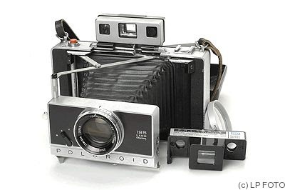
I love the look of vintage Polaroid cameras. Like this one:

via krphoto.com


And this one:
via collectiblend.com


And this one:
via Jim's Polaroid collection (polaroids.theskeltons.org)


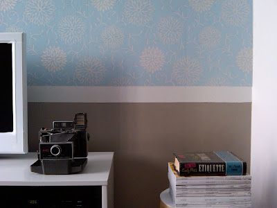
And this one, which I scored at Brooklyn Flea last summer (and which has since relocated to a different location in my apartment):


Monday, July 26, 2010

Why Hello, Sterling Cooper Draper Pryce.

I just finished watching the season premiere of Mad Men for the second time. I had to watch it twice to fully absorb all of the changes -- I was prepared for change, but I was not prepared for a seismic shift! (P.S. -- What did Betty and Henry Francis do with the velvet tufted headboard? I so miss that headboard.)

During my second viewing, I was able to focus on SCDP's new digs in the Time-Life building. The new offices have an entirely different vibe -- I do miss the sepia-toned hues of the old Sterling Cooper offices. But the new offices are beginning to grow on me. I was really struck by the bold use of color, which I first thought looked a little anachronistic for 1964. But as these photos from the House Beautiful archives have taught me, Sterling Cooper Draper Pryce was just catching up with the times:

circa February 1962


circa May 1962


circa October 1961


circa December 1961


circa February 1960

(All images via House Beautiful)